 Which one is Batman and which is Robin?
 Is Batman the stout one?
Designed by Zmik, the shimmer of the lamps has its stealth like quality that makes it interesting. If these were Batman and Robin's skirts, this will be a disturbing design.
 They look gorgeous in a dark room.
 When lit upfront, they look like folded aluminum. Those edges can hurt, if it falls you on you, you are dead.
via MocoLoco
Monday, September 28, 2009
SMIK's Batman and Robin
Wife of Brian (Who is Brian anyway?)
 I don't know what to say....
 These knitted beards, are these supposed to humor us? Aint sure
 But when you visit the designer's website, it leaves something good to people in general who actually get it...a smile. I am not sure if the Wife of Brian is another girl or this cute girl who just smelled f*rt.
via Swissmiss
Marcio Kogan's Brazilian Box
 Tucked in the densed vegetation near Rio de Janeiro, this beach house makes boxy architecture as sexy as its brazilian women...
 Talking about vistas using windows. This one doesn't have. Literally opening up the interior space to the outside.
 Tropical chic at its best. When tropical rains come, chic goes wet and wild.
 How the living room exposes itself to the outside. Those sexy chairs are so raw....uh!
 Marcio Kogan MK27 designed this box juxtaposed with paradise. sexy
 Still no brazilian women in sight..
via TrendsNow
Bench marks at London Design Week
 These are Wrong...
 and Woods' benches displayed during London Design Week.
 Eye-catching furniture but the prints on the benches look very disorienting (it makes you cross-eyed). It is as if they just stacked them altogether and looked unfinished. The print made it look worse.
 Had it not experimented with tiers, it could have looked cute in my patio (in my future patio in my future vacation house).
via Designboom
Dominic Wilcox's laces on viagra
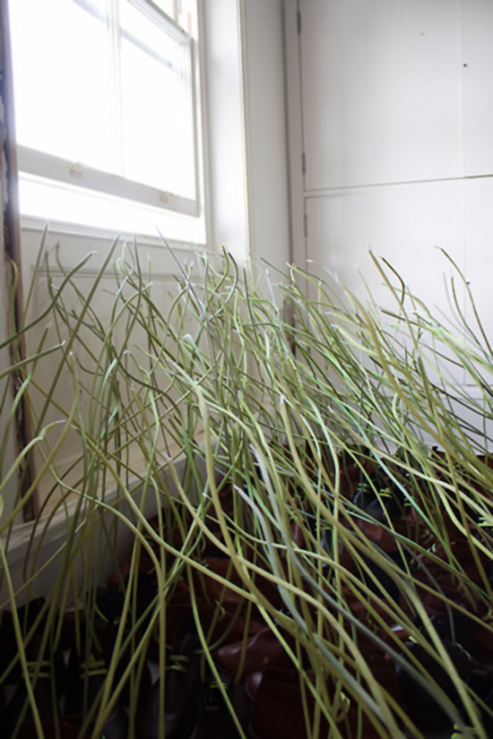
 Erected laces by Dominic Wilcox ...
  An installation for the London Design Week. 400 eco-friendly shoes were used to create a field of grasses. They reach out to the light, nature symbolising that products are connected with nature to which they ultimately return. Awwww..... The exhibit was sponsored by Terra Plana .
 You wonder how Dominic Wilcox made those laces stand.
 From afar, they really look like grasses. It makes you think that there is soil in the shoes.To make it stand, you need a good fertilizer, then the entire room will stink with really smelly shoes.
via Designboom
Santiago Calatrava's Belgian Connection
 Finally after 13 years...
Liège-Guillemins TGV Railway Station opens in Belgium designed by Spanish Architect Santiago Calatrava. Reminds you of the airport Eero Saarinen designed, except the details of Calatrava is finer because of available technology. Calatrava's concept is a station without a facade. Is that possible?
 I guess no interiors too. You also feel like you are outside, which is very Calatrava-ish.
 Via World Architecture News
Aissa Logerot's Transformers spoon
 Buy a spoon and get a?...
 Choptstick!
 Wait! There is more. If you order now, you get a sauce cup!
 Also good for mixing oil paints
 The pig snout and it's nose picker
 Awesome reinvention by Aissa Logerot called "Chopsticks Plus One and Two." Cuteness
via Designboom


