


 I don't want to start with the World Trade Center's development which became a rebuilding to forget 911. The towers look like they can be built anywhere. The memorial was quite ok,since it was like that the footprint was the scar of the destroyed twinnies. But again, you have to be imaginative to imagine the towers. Looking at this current cityscape (albeit just a rendering) makes you cringe because this side of New York became less iconic in terms of cityscape recall.
Now, maybe, there is hope with the Edgar Street Towers by IwamotoScott posted in Dezeen. Isolated from the commoners (Current World Trade Center Tower proposals), that tower on the right side has more umphh and scrotum to be a pompous ass, which is needed for New York to say that it is strong and resilient than just safe. Click on image and the Dezeen link to see more renderings of the interiors which has all the curves, tension and stretches of digital architecture.  Don't you think the ground floor resembles World-Trade Center's Ground level? Only this time it is sexy. It is very hard to think that this doesn't have any allusions to the deceased twin towers. IwamotoScotts' is a morphed version if we are to think that late WTC towers are the hard-on version....too hard it was stiff, this version seems that the dickwands finally engage each other..which is gay.... Anycow, this proposal is a far cry from the stupid and misfits of the World trade Center proposal (first image, the group of buildings on the right). It is good that Edgars Street Towers are staying away from the losers....
Monday, May 10, 2010
Reincarnation of the World Trade Center
Thursday, May 6, 2010
Attack of the Moles
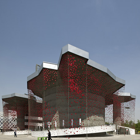
Ok beauty is in the I of the hottie looker... but man...this is just plain ugly to me. The idea is gewd...like catching energy from sun and camera flashes through those red dots. But the overall design...is not speaking to me....I wonder if the placement of the cells were strategically located..if not...they could have made it more dense... this net looking veil looks like it is infested by annoying areolas (your tits minus the nips) ... What if there was a pointillist kind of effect on the veil by gradually decreasing the density of warts as it crawls down the net...
 Sorta reminding you of this vintage hat. But this hat def looks better than that pavilion...Oh yeah, I forgot....Swiss Pavilion at Shanghai Expo, Designed by Buchner Brundler Posted in Dezeen
As the moles attack...I can hear plok, plok plok plok plok plok plok
Wednesday, May 5, 2010
Shrek Residences

This building Drooles!

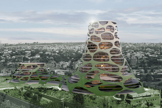
For a while, I thought that Future Systems are gone...until I saw another green monster... I thought it was a development of the library, Future System's designed (second image). I was wrong. Apparently, it's the better half..located at Yerevan, Armenia... this artificial hill was designed by Forrest Fulton Architecture/Lace Hill in ArchDaily... At first look, they look like they are brothus from the same father, John KaLicky.... While the other one looks like Slimer or pacman's ghost with measles, the other one is Flubber who didn't use Acne Gel, hence the scars.
 These scars are actually functional and more appealing up close. If you are a moron and didn't know that this is a fake hill, you will call Greenpeace and clamor for justice because your hill was poked all over. In ArchDaily, since there were reactions that this building resembles Future Sheestems library, there was a comment applauding its concept. I agree with tITs...medium not big tits...but again..face value wise...I don't like open pores. they are so gross..like they are kind of...like yuhckeeh and disguhsthhing?..this building seriously needs a good facial...anyways...
 Look at it, it looks like the nose of Shrek. (image above) The cartoon shows the smooth version, in reality, a dirty ogre secretes plenty of sebum. It is disgusting if you think of pores, especially when there are people in it already.. what are we like? blackheads?.... those bumps on top are also disturbing..reminds me of my crack. pore less crack..uh huh...pore less
 Tuesday, May 4, 2010
Giant Ticks in your living room
 Would you like that your living room has a funny looking idiot standing behind your sofa? I do... because he is family....wink wink..... Milan 2010/ Dezeen featured these furniture or farm crap by Campana Brothers as collection for Edra. Aptly called Barbarians, the materials used were very primeval. It is like 21st century meets Flintstones. I like the juxtaposition. Well, the Campana Brothers...are Brazilians. they live in Brazil...so they are Latinos. well.. Brazilian women are hot. so going back to Campana...well..these pieces..are really confusing me..there are some things in it that i hate and something in it that I love.. I think it is their Brazilian sensibilities...although you may not get it, because hotties can only get fellow Brazilian hotties...Just check out the brothers' websites and you will see how good they are..and probably understand why these..appear like these...
 I've seen a lot of sofa in cheap furnee shops that look like this (above pichur).... Like they clamped all those softee pillows together. I am not shallow...promise....but since I base my judgement on first impressions...I really don't get why there are airbags mixed in the sofa. What if someone deflates it? And I am sure, you also see the giant ticks...it is either the designers were inspired by their dogs and their suckers, or they simply love the idea of sucking.
goin back to the idiots...they come in pairs. I wonder if these two are a couple. If they are..then who is the boy and who is the girl? I can imagine a girl with bushy pussies, but the guy version...wow.. talking about finding weeble in the haystack...
Wednesday, April 14, 2010
Tonsils inspired Restaurant
 Koichi Takada Architects designed this Restaurant inspired by a cave! (post in ArchDaily)... Cave?........more like a buccal cavity... i can smell onion, tooth decay and serious case of halitosis. This cute space has a nice material though....which is wood....which is also flammable....i cant imagine grilling pork in this space...or we will be setting the entire space on fire..which is hot...tsssss.... only clean food i guess...the cavernous space reminds you of being inside moby dick's tummy...The interior struture is something skeletal...like ribs .... so we go back to porksteak..and beefstew....
Thursday, April 8, 2010
Warts on Daniel Libeskind

 If architecture has Zaha Hadid as its superstar, landscape architecture has Martha Schwartz. Like I always say to the authors of the designs I make fun of, I am a fan of that designer (really!). I have known Warts since I was in college, which was...omg... two years ago? (haha)... When you say landscape architecture, you expect plants in their "cosmeticated" bests.. So Martha Steward said...if you are going to alter nature's natural form..why limit yourself?...so she's gone more than horticulture (no idea what my basis is for this statement).... I particulary love the donuts and the circular holes once Marthy designed...but it's been a long time ago since I saw it....and to my surprise...she is still kickin and alive....take this Dublin's Grand Canal Square posted in Contemporists. One comment said that they look like Starwars' light sabers sticking out from the ground. I say, Marthwarts was designing this while she was having an accupuncture. it is abstract, so it can be anything honessslee. Apparently, the square is beside Daniel Libeskind's building....now it makes sense...accupuncture helps in eliminating all the toxins from Danny's shards.
Monday, April 5, 2010
eCOKE friendly bottles

 Joining the trend to counter the effects of global warning is this design of eco coke bottle by andrew kim (posted in designboom a week ago). According to Andrew, it saves space...so it is eco friendly. All along i thought that the lower portion of the bottle is made of paper....so it is.... bioincredible ......or bioregretable.... or something that will dissolve quikie...IT's NOT. it just saves space...it's quite disappointing. Allllthough.. i love the look. it really competes against the new branding and label design of petsee gola. When displayed...it looks so orderly. The second image above shows the coolness of these bottles when placed side by side. From left, you have...far..fart cola, then the coca, prit, coca ciet, and S water.
Come to think of it, it will be weird to drink something with a fizz from a tetra pack. Try replacing your milk in that tetra pack with coke...and see what the experience is like...weird right? (Image below) Another cool thing about this new design, again when displayed, is when you put them on top of each other... they all bolt in like....like... they are screwing each other.
Riddle: A long and hard object on a wet surface

 You have to be smart to know the answer to that riddle. Unless you looked at the picture already...then that's cheating!
I love this bridge! It is a gentle but sharp sweep of blade-like footbridge on top of this River in Maribor. Designed by Arhitektura doo all of you (Footbridge in Maribor by Arhitektura d.o.o posted in ArchDaily. ) you wonder how this bridge will support itself. Do we have the technology already to make this bridge erect this way? Do we viagra on concrete mixtures already?
Thursday, April 1, 2010
Fur Ball at Shanghai Expo 2010
 I love fur balls. this fur ball looking building is the UK pavilion at Shanghai Expo 2010 designed by Thomas Heatherwick (post in Dezeen). It is called seed cathedral. Don't be deceived by its soft appearance cus it's nothin cuddly. It's more like...a sea urchin or an ant eater. However, those spines won't hurt you because they are made of fibre optic rods. The design is made to draw in light to the interior at daytime and ...render a halo like glow at night through it's fiber optic filaments...ohhh...can't wait to see it finished. Anyway, again it will not hurt...unless I push you to it.
Wednesday, March 31, 2010
Mini me's potato chips

Let's shift our attention from the London O12 to Q in the mid east. This is Jean Nouvel's proposal for the National Museum in Qatar (post in ArchDaily). According to Jean "mini me" Nouvel, his design can likened to a bladelike petal of the desert rose....do i hear Sting singin? It will be the first thing you will see once you arrive at the airport of Qatar. I must admit that it is a fresh take in architecture (although im not sure)... I like the interlocking of the discs....they look like mutant clamshells. From afar, i am sure that light will give this structure a dramatic effect. You can associate so many things to it..like jean nouvel's dishwasher. I would also suggest two or three circular ponds, in it are different water features....mustard, ketchup, and mayo..dips for your pringles....once you pop you can't stop.
Zaha's O Oh Aquatics Centre
 oooohhkay..another London Olympic vuilding. This one by my favorite gahl...Zaha Hadeed. Well..everybody knows that it's actually her minions who are now doin the designs....while she poses with her fav miyake ensemble like a supermogul ..and prolly Ms.Z just checks if the design really appears something that was inseminated in her....this aquatics center however, looks like a mongoloid amongst Zaha's creations. It misses a chromosome of fluidity...like the xx or xy suddenly became xyz? My Q is ..Y the hell Z? Y did you allow this impurity..it is so not you. How can a fat but yes, somehow curvey form suddenly have a cardboard looking flaps. It looks like a leech just crushed a building....it is a big Q. M sure therell be more from U...U R still my Z. just dont make us say O again.
The fugly sister of Eiffel Towel

London and Paris are such good Euro sisters. Paris has a popular se* toy....none other than her Eiffel dildo. For some strange reason, London was so jealous, now it is creating its own for the Olympics in 2012, called Arcellow Mittal Orbit, designed by Anish Kapoor (Dezeen post). Although not as big as the Eiffel tootsie roll... the knotting and the crazy curves surely can stimulate the senses. Thanks to Arup, London had never been this kinkeeee.
Tuesday, March 30, 2010
Levitt Birdstein's feathers

Hi guys...i am back...if were not with the anonymous commentator...i would have returned,probably next week is the soonest....but since...i feel like there is an insistent clamor, cry, and hysterical public demand...i insist that there is... here i am....believe me... anonymous..whoever you are.....you touched me....
The image above... is indeed a stunning building.....except for the chopstick in the middle. Unfortunately, that long.... hard.... erected....and most likely warm rod is needed cus the building is a heating structure for the University of Liverpool designed by Levitt Bernstein (post in Dezeen).duh. Still, it was poetically placed smacked in the middle... like stabbing the building with an icepick. Anyways..... I am loving the skin.... and I have a feeling that Levitt had these brids for insporayshun....

if you don't get it...... well... i don't too...some reason those pitched structures reminded me of these gossipin birds.... tequila
Thursday, March 11, 2010
Zaha Hadid's New Curves in Italy
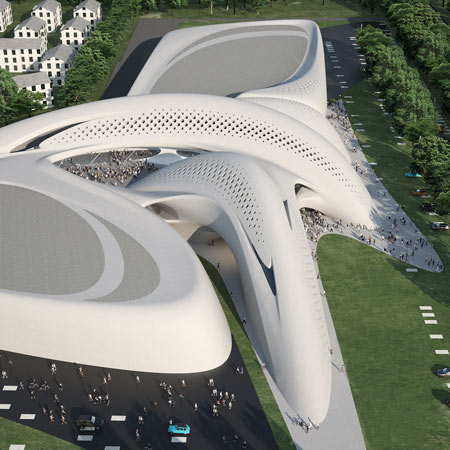
I miss Haha Zadid. We once had a "look a like" post of architecture's only Diva recently...and now....she's on the architecture headlines again! Posted in Dezeen is Jesolo Magica in Italy. It is going to be a retail center with some business center stuff in it. I dunnnnooo, I know retail planning has some kind of rules..like dumbell effect and shit to make business and ROI really pissssible. I guess, since it is a designer mall, people will still flock to it..age old Guggie effect they cal tit. But can you imagine putting advertisements on those pristine curvy walls? Can retail business do without it? It will be like vandalizing a piece of art (to some people)... sacrilege (is this the right sacrament) to the holier than me architecture wisdomden. Anyways....while it looks like a kewwl form... they also look like two whales fuckin. But the image below...is really yucky... it's like a skinned monster.
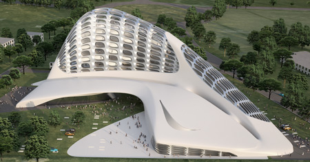
Actually, overall..they really like monsters...nice and kind monsters because it's white. except the second image is a fugly monster.... still cool.....
Since Zaha always gives us her cool curves (eeueew..now those kind of curves....grrrh)... we are always curious to see and look at it... and if opportunity arises.... some like bashing it!.... either they are so freakin' jelly beans or they just hate design formalism. Me... I am goin to admit, I always look forward to seein...her work...and makin fun of it....... and her. It will be a sad architecture world if no swift curves are coming into the architecture world... Because right now, couldn't think of any architect that gives us..this kind of kikpuss work.
Tuesday, March 9, 2010
Lu Flux's Boom boom Pow!

You may not get it....i will just sing ...
BOOM BOOM POW by Black Eyed Peas
Gotta get-get, gotta get-get
Gotta get-get, gotta g-g-g-get-get-get, get-get
Boom boom boom, gotta get-get
Boom boom boom, gotta get-get
Boom boom boom, gotta get-get
Boom boom boom, gotta get-get
Boom boom boom, now
Boom boom boom, now
Boom boom pow
Boom boom
Yo, I got that hit that beat the block
You can get that bass overload
I got the that rock and roll
That future flow
That digital spit
Next level visual shit
I got that boom boom pow
How the beat bang, boom boom pow
I like that boom boom pow
Them chickens jackin' my style
They try copy my swagger
I'm on that next shit now
I'm so 3008
You so 2000 and late
I got that boom, boom, boom
That future boom, boom, boom
Let me get it now
Boom boom boom, gotta get-get ....
Dezeen's Dame and Knight by Lu flux post. Lu Flux creations are pow wow wow...im still not going to wear it! (just for display)
Sunday, March 7, 2010
OFIS' Stockings
Skin skin skins! They are only ok if it is really sexy.....This case i am not so sure. It is sort of tacky...for me...but definitely has its merits.... Designboom had a recent post on the Mercedez Benz Tower competition proposal by Slovenian practice OFIS Architecture. The tower looks ordinary and the skin....i can only interpret it in two ways:
I have a feeling OFIS got their inspirayshun from this:

or this?
Friday, March 5, 2010
Karim's Cute Bottle
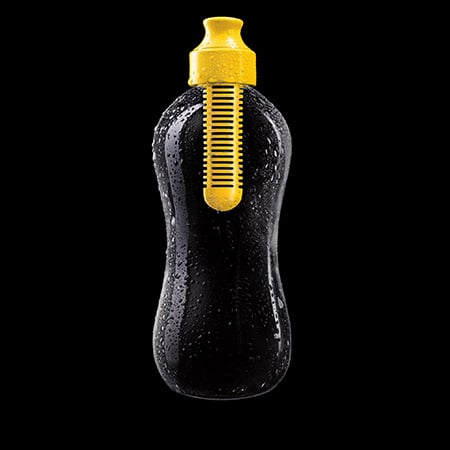 I always love Karim Rashid's design. Most, if not all have an element of fun in it. This post in Dezeen called Bobble is a water bottle with built-in filter for tap H2O. The top part of the bottle comes in different colors. And no designer that i know of, at this moment, use color as a signature as Rashid does. Many of Rashid's designs are toy-like. Sometimes...if you are a real man-man's man-everybody's man-ladies'man..and all that...you are not sure if you will be comfy carrying rashid's fruity and jolly creations in public. But it is fun as a collection...especially, if you are design savvy. But still aint sure if i can carry this around the gym. This comes handy when you are stranded in the desert and your only option is your perspiration and urine. Ok that's gross...
Wednesday, March 3, 2010
Fault Line...Really?
 From what I know, Design Blogs usually get their contents from the designers themselves. It is a marketing tool for their product or services. Usually!..I am not saying all. I am not sure if this latest product at Contemporist was a submission or Contemporist's original feature. I can't help be bothered.... Haiti's earthquake is still fresh in our minds and recently, a disturbing 8.8 magnitude earthquake shook Chile that created some tsunami frenzy. This design called Fault Line Bench by Cameron Van Dyke surely has it goin for itself for bad publicity. Yeah..it may not do harm...but wow..this timing is unbelievably dicky.
Tuesday, March 2, 2010
Comme des Garcons' Number 3

I am bringin' a friend (who gives me links to different design sources in the web) to help me discuss design through chat...our conversation went:
Boy Amoeba: Commes de Garcons, Number 3 in Athens.
http://www.yatzer.com/2144_number_3__store_in_athens.gr
DD: Booooooring...do you have other designs?
Boy Amoeba: Later... can you just take a look at it.
DD: Yaaaawwwwnnnn....excuse me. where am I? oh... is it a garage sale?
Boy Amoeba: It is just minimalist..
DD: ..Yatzer article sez that Guerilla spent minimal on interiors. Really?..it doesn't show
Boy Amoeba: Sarcastic much?
DD: Look at that..it is like my garage...only clean n white.
Boy Amoeba: It was designed by Dimitris Papadopoulos with Yiannis Kondilis...according to them..their concept is "white light and bright"..yeah it'skind of obvious. But I get this kind of aesthetic. There is something industrial with it...you're right..a bit like a garage ...in a beautiful way.
DD: It feelslike a chic version of a slaughter house. Remember the movie Get Smart? The room where Steve Carell humped the fat villain.... it is like that room...
Boy Amoeba: Huh?
DD: Like a morgue.
Boy Amoeba: ..I can see that.
DD: Now you agree with me?
Boy Amoeba: No
DD: f.you. just admit it.
Boy Amoeba: anyways, I still like it
DD: It is just so....clean..and the lighting is terrible... I can imagine blood splattered all over the wall.
Boy Amoeba: Huh I dont get it.
DD: those are 3 different statements..
Boy Amoeba: I gotta go. later
DD: I am not done yet.
(Discontinued)
Saturday, February 27, 2010
Sleeping Vendo

Now this is a pod. I love the sleepbox by Arch Group. It is like a vendo machine for power naps or laziness. It is ideal for airports, bus terminals and other busy urban areas. Rentable like a hotel room, bed sheets are changed regulary. So this is good if you are stranded in a city and have nowhere to go....I am curious of the rent rates though. How competitive the rate is than staying in a cheap hotel. The only missing is your own toilet maybe because there are public comfort rooms out there. So if you are a bachelor and wants to save a lot.... all you need is a toothbrush and a sprinkle of water on your body's warm areas.... it will be strange though, that your bedsheets is cleaner than you.

Kokkugia's S/craps

Parametrick design is the IN thing today. If you don't know how to use advanced digital softwares...you don't belong to the Kewl group. But no worries...cuz the only cool thing about 'em are the forms....the peeps behind it...are actually geekozoids. You hafta learn Maya, Rhino and other animals in the 3d modelling world to be able to sport a hot fashionable architechuh. Before you know it, you are already balding... or hairline is already receding.... i hope this is not the case behind kokkugia, a studio of three young guys who obviously came from digital savvy schools such as Heyhey and Columbyah. The design (posted in Designboom) is their entry for the Taipei Performing Arts Center Competition which was won by OMA. Their scheme looks like meta scraps king kong crampled and made into a roof. WHICH by the way..takes forever to make in a modelling software! The program was influenced by the contour underneath so you have those boxes... on top of it...kingkong threw the scraps...

Kingkong has been scraping his mucous and booger on the scraps..sp underneath it created these interesting network of trusses....awesome..isn'tit?
Friday, February 26, 2010
Clappers in 36 The Calls competition
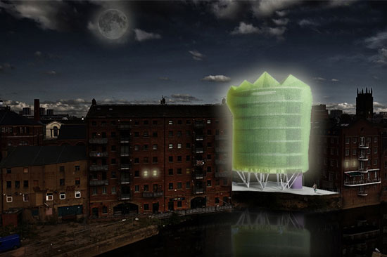
These two are not shortlisted entries.... Just two of the few designs that were featured in other blogs bec of ...I guess...design metits..... It is for the competition 36 The Calls which asked participants to design a building in a vacant lot in Leeds, You OK. It is like providing a missing link, except architects really like their work to stand out..so they make their building cuss from its context. Which is cool because, you dont want another fake oldy built. ...so these two ...a cucumber and a cheesegrater didnt make the cut in the said competition. For the cucumber scheme which studiodosi designed.... cant really describe it well.. it just looks like a huge drum covered with plants that glow in the dark. the program is bohooo... nothing new....but clap clap for thinking of the environment....anyways...if you have a garden roof and climbing ivies on walls..you receive an instant clap clap from design dummy...(as if it matterS)....
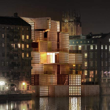
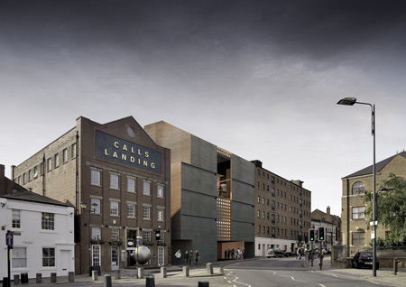
The second one..designed by Davide Marchetti Architetto..which was ...something that looks like a scheme that had a more interesting program and B.S.--ing with it's design..which is really just "push and pull"... is more fitting with the context....according to the designers is made of rammed earth where they introduced the holes....these walls act as sunscreen..... however, it looks like copper in the renderings. I agree with one of the comments in Dezeen that the it was a big mistake to make the opposite side (street side) a blank wall...it is like J.Lo without the ass....
"Lladro" Erotica

I tot'at'ferst, that this was a work of a jap. We all know that japs are stylish and fashionable... but because of their awesome 80s animation and comics...like manga... they can also be pretty much.... as-horny-as-everybody-in-the-world-can-get.. prolly hornier. This post is long overdue since the exhibitionists figurines were showed only until Feb 15 in Gallery Nine NY. weee NY! I first saw it in Dezeen but when I saw it again in Karmatrendz...there was a divine intervention that called me to repost it.... It is called Undressed by Jessica Lichtenstein. I cant help notice the use of past tense - undressed. The girls are still covered...I aint seein titties and pussies yet...just all provocation and eroticism (which I still love). that's my foyst comment. Also, I wonder if these were pure manga and anime merchandise...will it still qualify as art since it was made by japs themselves? Does it mean it has to be a work of a non-jap to be regarded as artistits?Other than that... all i can say that this is 21st century Lladro evolution..aint sure if these figurines are made of porcelain or some kind of stone material.... but if it is...yes...21st century lladros... that will never go along with your chinaware...bec these look like toys.... if you have a console for sextoys...these will def look geeeewd. they look like plastic or some kind of rubber...soft and supple....like dildos.... toys you never had when you were a kid.

Thursday, February 25, 2010
Calatrava's Manolo Blahnik
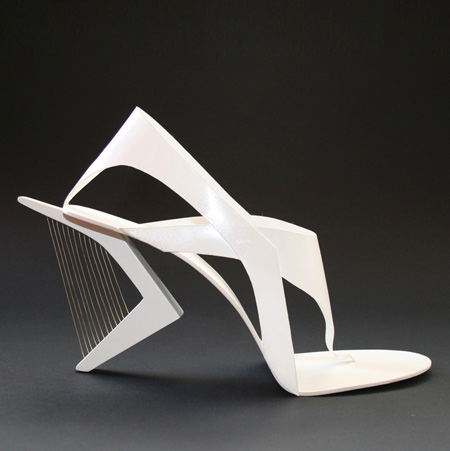
We have seen Zaha design her shoes...which turn our to look very her...not ursula-ish....curves and all that. With this blog entry, the architect's works become the inspiration. In Dezeen, Tea Petrovic's Shoes pay homage to Calatrava and a sculptor named, Naum Gabo. I am not so familiar with the sculptor, but with Santhiagoh....we go waaayyyy back...UH HUH... way back... way back when the only architects you knew was Frank, Louis and Mies... then all of a sudden Santiago's bridge make a debut...so pristine and white but dynamic...So I said... Eero Saarinen is so last decade (snap snap on air) ... Don't get me wrong, I love Eero.... in a vintage kind of way. Santiago has really defined himself in the world of architecture geeks...whose designs are becoming a source of aesthetic. Now I wonder, if Tea is alluding her design aesthetic to other artists/designers..im curious what her own design voice is. Still, even if I am not a shoe lover, the first time I saw these Petrovic's shoes, I remember myself seeing Caltrava's bridge for the first time. It was like the orgasm that Carrie Bradshaw was having over a pair of Manolos. Purely magical.
Subscribe to:
Comments (Atom)
