


 I don't want to start with the World Trade Center's development which became a rebuilding to forget 911. The towers look like they can be built anywhere. The memorial was quite ok,since it was like that the footprint was the scar of the destroyed twinnies. But again, you have to be imaginative to imagine the towers. Looking at this current cityscape (albeit just a rendering) makes you cringe because this side of New York became less iconic in terms of cityscape recall.
Now, maybe, there is hope with the Edgar Street Towers by IwamotoScott posted in Dezeen. Isolated from the commoners (Current World Trade Center Tower proposals), that tower on the right side has more umphh and scrotum to be a pompous ass, which is needed for New York to say that it is strong and resilient than just safe. Click on image and the Dezeen link to see more renderings of the interiors which has all the curves, tension and stretches of digital architecture.  Don't you think the ground floor resembles World-Trade Center's Ground level? Only this time it is sexy. It is very hard to think that this doesn't have any allusions to the deceased twin towers. IwamotoScotts' is a morphed version if we are to think that late WTC towers are the hard-on version....too hard it was stiff, this version seems that the dickwands finally engage each other..which is gay.... Anycow, this proposal is a far cry from the stupid and misfits of the World trade Center proposal (first image, the group of buildings on the right). It is good that Edgars Street Towers are staying away from the losers....
Monday, May 10, 2010
Reincarnation of the World Trade Center
Thursday, May 6, 2010
Attack of the Moles
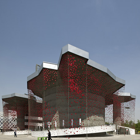
Ok beauty is in the I of the hottie looker... but man...this is just plain ugly to me. The idea is gewd...like catching energy from sun and camera flashes through those red dots. But the overall design...is not speaking to me....I wonder if the placement of the cells were strategically located..if not...they could have made it more dense... this net looking veil looks like it is infested by annoying areolas (your tits minus the nips) ... What if there was a pointillist kind of effect on the veil by gradually decreasing the density of warts as it crawls down the net...
 Sorta reminding you of this vintage hat. But this hat def looks better than that pavilion...Oh yeah, I forgot....Swiss Pavilion at Shanghai Expo, Designed by Buchner Brundler Posted in Dezeen
As the moles attack...I can hear plok, plok plok plok plok plok plok
Wednesday, May 5, 2010
Shrek Residences

This building Drooles!

For a while, I thought that Future Systems are gone...until I saw another green monster... I thought it was a development of the library, Future System's designed (second image). I was wrong. Apparently, it's the better half..located at Yerevan, Armenia... this artificial hill was designed by Forrest Fulton Architecture/Lace Hill in ArchDaily... At first look, they look like they are brothus from the same father, John KaLicky.... While the other one looks like Slimer or pacman's ghost with measles, the other one is Flubber who didn't use Acne Gel, hence the scars.
 These scars are actually functional and more appealing up close. If you are a moron and didn't know that this is a fake hill, you will call Greenpeace and clamor for justice because your hill was poked all over. In ArchDaily, since there were reactions that this building resembles Future Sheestems library, there was a comment applauding its concept. I agree with tITs...medium not big tits...but again..face value wise...I don't like open pores. they are so gross..like they are kind of...like yuhckeeh and disguhsthhing?..this building seriously needs a good facial...anyways...
 Look at it, it looks like the nose of Shrek. (image above) The cartoon shows the smooth version, in reality, a dirty ogre secretes plenty of sebum. It is disgusting if you think of pores, especially when there are people in it already.. what are we like? blackheads?.... those bumps on top are also disturbing..reminds me of my crack. pore less crack..uh huh...pore less
 Tuesday, May 4, 2010
Giant Ticks in your living room
 Would you like that your living room has a funny looking idiot standing behind your sofa? I do... because he is family....wink wink..... Milan 2010/ Dezeen featured these furniture or farm crap by Campana Brothers as collection for Edra. Aptly called Barbarians, the materials used were very primeval. It is like 21st century meets Flintstones. I like the juxtaposition. Well, the Campana Brothers...are Brazilians. they live in Brazil...so they are Latinos. well.. Brazilian women are hot. so going back to Campana...well..these pieces..are really confusing me..there are some things in it that i hate and something in it that I love.. I think it is their Brazilian sensibilities...although you may not get it, because hotties can only get fellow Brazilian hotties...Just check out the brothers' websites and you will see how good they are..and probably understand why these..appear like these...
 I've seen a lot of sofa in cheap furnee shops that look like this (above pichur).... Like they clamped all those softee pillows together. I am not shallow...promise....but since I base my judgement on first impressions...I really don't get why there are airbags mixed in the sofa. What if someone deflates it? And I am sure, you also see the giant ticks...it is either the designers were inspired by their dogs and their suckers, or they simply love the idea of sucking.
goin back to the idiots...they come in pairs. I wonder if these two are a couple. If they are..then who is the boy and who is the girl? I can imagine a girl with bushy pussies, but the guy version...wow.. talking about finding weeble in the haystack...
Subscribe to:
Posts (Atom)
