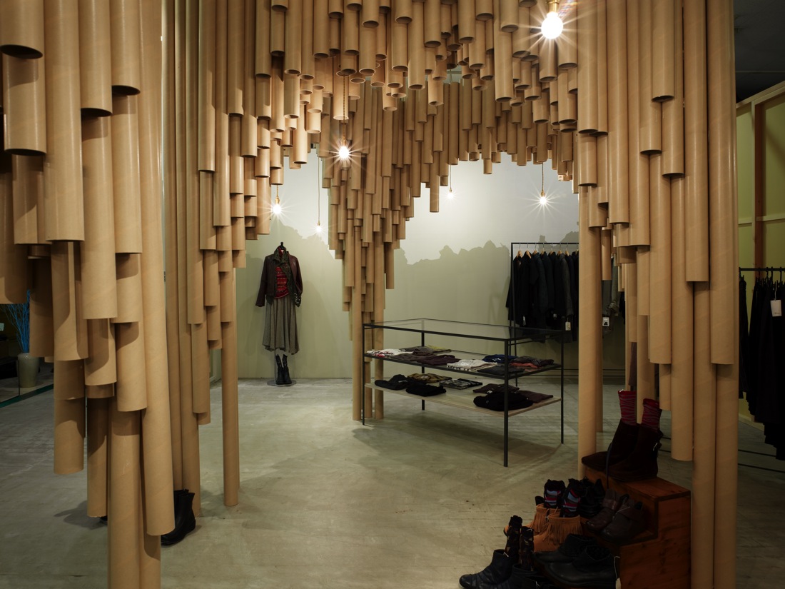
Ok. For a while I thought that the store is just a storage with some clothes in it. I must say that the designers are lucky to have a client who is design savvy. Well Japanese folks are generally stylish and fashionable. I said that because, it is rare that an overpowering design like this is applied to a store. Do you notice the design before the merchandise? It's probably because the store really wants to get noticed. But since the material is "paper-ish" with an impression that is "box-ish" in a "storage-ish" kind of way, then maybe the clothes stand out. "Maybe-ish."
If you scroll down at ArchDaily's post of Suppose Design Office's Karis store you see how the paper tubes create cathedral-like spaces. By the way,I love paper (t)pubes. IT was all started by pringles look alike Shigeru ban (I think) with his chapel and all..... I just wish that SDO didn't put gloss onto the tubes. They look like pipes or downspouts. Take out the clothes, this will make a gaddamn hardware store for pipes. forget P.S.1! I can imagine people peeping through the holes at the bottom. Blow air into it, it might even create sound. So many possibilities. I imagine me, scraping my booger in one.
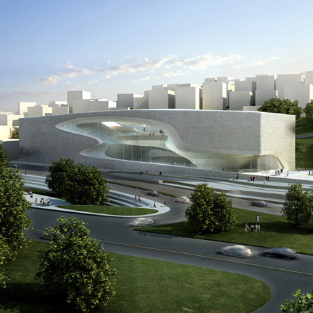
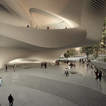 Speaking of Ursula.Found this post at dezeen the other day. Zaha's design of the King Abdullah II House of Culture & Art. How can you not love Haha's new opus? We usually get aversion towards her work whenever something new comes out (because of insecurity ferhafs). I remember in one forum that,with the numerous projects Zaha's firm (can you call it firm) is doin, it is actually not Zaha who designs anymore. A lot of em' are grads from AA where Ursula and his partner, Patrick Shoemaker regularly hangs out and drink beers. Just an fyi, AA is where Zaha learned to be wild.Goin back to this performing arts center, I have to admit, this is one of my favs in Hadid collecshun. The design is derived from the carved stone buildings and eroded rock formations at Petra in Jordan.