Wednesday, March 31, 2010

Mini me's potato chips

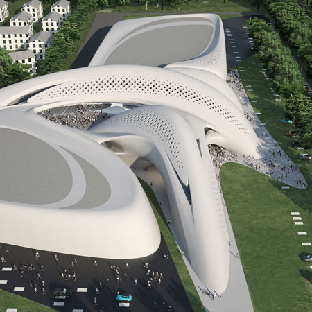
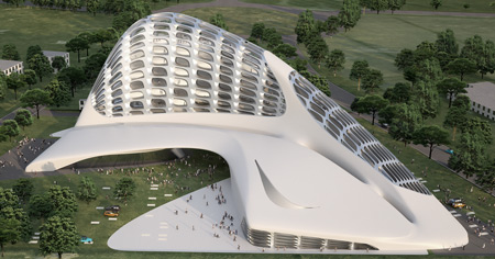
Let's shift our attention from the London O12 to Q in the mid east. This is Jean Nouvel's proposal for the National Museum in Qatar (post in ArchDaily). According to Jean "mini me" Nouvel, his design can likened to a bladelike petal of the desert rose....do i hear Sting singin? It will be the first thing you will see once you arrive at the airport of Qatar. I must admit that it is a fresh take in architecture (although im not sure)... I like the interlocking of the discs....they look like mutant clamshells. From afar, i am sure that light will give this structure a dramatic effect. You can associate so many things to it..like jean nouvel's dishwasher. I would also suggest two or three circular ponds, in it are different water features....mustard, ketchup, and mayo..dips for your pringles....once you pop you can't stop.

Zaha's O Oh Aquatics Centre

oooohhkay..another London Olympic vuilding. This one by my favorite gahl...Zaha Hadeed. Well..everybody knows that it's actually her minions who are now doin the designs....while she poses with her fav miyake ensemble like a supermogul ..and prolly Ms.Z just checks if the design really appears something that was inseminated in her....this aquatics center however, looks like a mongoloid amongst Zaha's creations. It misses a chromosome of fluidity...like the xx or xy suddenly became xyz? My Q is ..Y the hell Z? Y did you allow this impurity..it is so not you. How can a fat but yes, somehow curvey form suddenly have a cardboard looking flaps. It looks like a leech just crushed a building....it is a big Q. M sure therell be more from U...U R still my Z. just dont make us say O again.


The fugly sister of Eiffel Towel


London and Paris are such good Euro sisters. Paris has a popular se* toy....none other than her Eiffel dildo. For some strange reason, London was so jealous, now it is creating its own for the Olympics in 2012, called Arcellow Mittal Orbit, designed by Anish Kapoor (Dezeen post). Although not as big as the Eiffel tootsie roll... the knotting and the crazy curves surely can stimulate the senses. Thanks to Arup, London had never been this kinkeeee.


Tuesday, March 30, 2010

Levitt Birdstein's feathers


Hi guys...i am back...if were not with the anonymous commentator...i would have returned,probably next week is the soonest....but since...i feel like there is an insistent clamor, cry, and hysterical public demand...i insist that there is... here i am....believe me... anonymous..whoever you are.....you touched me....

The image above... is indeed a stunning building.....except for the chopstick in the middle. Unfortunately, that long.... hard.... erected....and most likely warm rod is needed cus the building is a heating structure for the University of Liverpool designed by Levitt Bernstein (post in Dezeen).duh. Still, it was poetically placed smacked in the middle... like stabbing the building with an icepick. Anyways..... I am loving the skin.... and I have a feeling that Levitt had these brids for insporayshun....

if you don't get it...... well... i don't too...some reason those pitched structures reminded me of these gossipin birds.... tequila


Thursday, March 11, 2010

Zaha Hadid's New Curves in Italy


I miss Haha Zadid. We once had a "look a like" post of architecture's only Diva recently...and now....she's on the architecture headlines again! Posted in Dezeen is Jesolo Magica in Italy. It is going to be a retail center with some business center stuff in it. I dunnnnooo, I know retail planning has some kind of rules..like dumbell effect and shit to make business and ROI really pissssible. I guess, since it is a designer mall, people will still flock to it..age old Guggie effect they cal tit. But can you imagine putting advertisements on those pristine curvy walls? Can retail business do without it? It will be like vandalizing a piece of art (to some people)... sacrilege (is this the right sacrament) to the holier than me architecture wisdomden. Anyways....while it looks like a kewwl form... they also look like two whales fuckin. But the image below...is really yucky... it's like a skinned monster.
Actually, overall..they really like monsters...nice and kind monsters because it's white. except the second image is a fugly monster.... still cool.....

Since Zaha always gives us her cool curves (eeueew..now those kind of curves....grrrh)... we are always curious to see and look at it... and if opportunity arises.... some like bashing it!.... either they are so freakin' jelly beans or they just hate design formalism. Me... I am goin to admit, I always look forward to seein...her work...and makin fun of it....... and her. It will be a sad architecture world if no swift curves are coming into the architecture world... Because right now, couldn't think of any architect that gives us..this kind of kikpuss work.

Tuesday, March 9, 2010

Lu Flux's Boom boom Pow!


You may not get it....i will just sing ...


BOOM BOOM POW by Black Eyed Peas

Gotta get-get, gotta get-get
Gotta get-get, gotta g-g-g-get-get-get, get-get

Boom boom boom, gotta get-get

Boom boom boom, now
Boom boom boom, now
Boom boom pow
Boom boom

Yo, I got that hit that beat the block
You can get that bass overload
I got the that rock and roll
That future flow

That digital spit
Next level visual shit
I got that boom boom pow
How the beat bang, boom boom pow

I like that boom boom pow
Them chickens jackin' my style
They try copy my swagger
I'm on that next shit now

I'm so 3008
You so 2000 and late
I got that boom, boom, boom
That future boom, boom, boom
Let me get it now

Boom boom boom, gotta get-get ....

Dezeen's Dame and Knight by Lu flux post. Lu Flux creations are pow wow wow...im still not going to wear it! (just for display)

Sunday, March 7, 2010

OFIS' Stockings


Skin skin skins! They are only ok if it is really sexy.....This case i am not so sure. It is sort of tacky...for me...but definitely has its merits.... Designboom had a recent post on the Mercedez Benz Tower competition proposal by Slovenian practice OFIS Architecture. The tower looks ordinary and the skin....i can only interpret it in two ways:

I have a feeling OFIS got their inspirayshun from this:
or this?
The design according to OFIS, represents elements of the landscape....why not just say they were inspired by military camouflage net.The only thing that makes the outer layer special is that ...according to them..it changes as a reaction to weather or season. The building looks like it's covering itself with a blanket...Let's hope it materializes...but right now...it feels like an after thought....


Friday, March 5, 2010

Karim's Cute Bottle

I always love Karim Rashid's design. Most, if not all have an element of fun in it. This post in Dezeen called Bobble is a water bottle with built-in filter for tap H2O. The top part of the bottle comes in different colors. And no designer that i know of, at this moment, use color as a signature as Rashid does. Many of Rashid's designs are toy-like. Sometimes...if you are a real man-man's man-everybody's man-ladies'man..and all that...you are not sure if you will be comfy carrying rashid's fruity and jolly creations in public. But it is fun as a collection...especially, if you are design savvy. But still aint sure if i can carry this around the gym. This comes handy when you are stranded in the desert and your only option is your perspiration and urine. Ok that's gross...


Wednesday, March 3, 2010

Fault Line...Really?

From what I know, Design Blogs usually get their contents from the designers themselves. It is a marketing tool for their product or services. Usually!..I am not saying all. I am not sure if this latest product at Contemporist was a submission or Contemporist's original feature. I can't help be bothered.... Haiti's earthquake is still fresh in our minds and recently, a disturbing 8.8 magnitude earthquake shook Chile that created some tsunami frenzy. This design called Fault Line Bench by Cameron Van Dyke surely has it goin for itself for bad publicity. Yeah..it may not do harm...but wow..this timing is unbelievably dicky.


Tuesday, March 2, 2010

Comme des Garcons' Number 3

I am bringin' a friend (who gives me links to different design sources in the web) to help me discuss design through chat...our conversation went:

Boy Amoeba: Commes de Garcons, Number 3 in Athens.

http://www.yatzer.com/2144_number_3__store_in_athens.gr

DD: Booooooring...do you have other designs?

Boy Amoeba: Later... can you just take a look at it.

DD: Yaaaawwwwnnnn....excuse me. where am I? oh... is it a garage sale?

Boy Amoeba: It is just minimalist..

DD: ..Yatzer article sez that Guerilla spent minimal on interiors. Really?..it doesn't show

Boy Amoeba: Sarcastic much?

DD: Look at that..it is like my garage...only clean n white.

Boy Amoeba: It was designed by Dimitris Papadopoulos with Yiannis Kondilis...according to them..their concept is "white light and bright"..yeah it'skind of obvious. But I get this kind of aesthetic. There is something industrial with it...you're right..a bit like a garage ...in a beautiful way.

DD: It feelslike a chic version of a slaughter house. Remember the movie Get Smart? The room where Steve Carell humped the fat villain.... it is like that room...

Boy Amoeba: Huh?

DD: Like a morgue.

Boy Amoeba: ..I can see that.

DD: Now you agree with me?

Boy Amoeba: No

DD: f.you. just admit it.

Boy Amoeba: anyways, I still like it

DD: It is just so....clean..and the lighting is terrible... I can imagine blood splattered all over the wall.

Boy Amoeba: Huh I dont get it.

DD: those are 3 different statements..

Boy Amoeba: I gotta go. later

DD: I am not done yet.

(Discontinued)


ShareThis