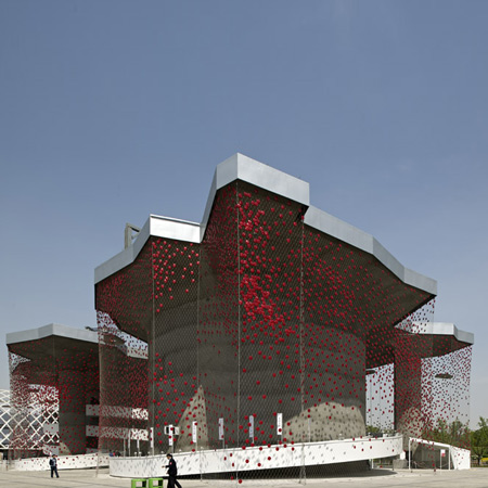
Ok beauty is in the I of the hottie looker... but man...this is just plain ugly to me. The idea is gewd...like catching energy from sun and camera flashes through those red dots. But the overall design...is not speaking to me....I wonder if the placement of the cells were strategically located..if not...they could have made it more dense... this net looking veil looks like it is infested by annoying areolas (your tits minus the nips) ... What if there was a pointillist kind of effect on the veil by gradually decreasing the density of warts as it crawls down the net...
 Sorta reminding you of this vintage hat. But this hat def looks better than that pavilion...Oh yeah, I forgot....Swiss Pavilion at Shanghai Expo, Designed by Buchner Brundler Posted in Dezeen
As the moles attack...I can hear plok, plok plok plok plok plok plok


0 comments:
Post a Comment