Wednesday, February 24, 2010
SDO's Paper (t)Pubes
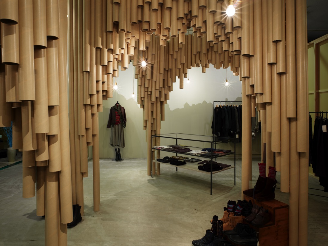
Ok. For a while I thought that the store is just a storage with some clothes in it. I must say that the designers are lucky to have a client who is design savvy. Well Japanese folks are generally stylish and fashionable. I said that because, it is rare that an overpowering design like this is applied to a store. Do you notice the design before the merchandise? It's probably because the store really wants to get noticed. But since the material is "paper-ish" with an impression that is "box-ish" in a "storage-ish" kind of way, then maybe the clothes stand out. "Maybe-ish."
If you scroll down at ArchDaily's post of Suppose Design Office's Karis store you see how the paper tubes create cathedral-like spaces. By the way,I love paper (t)pubes. IT was all started by pringles look alike Shigeru ban (I think) with his chapel and all..... I just wish that SDO didn't put gloss onto the tubes. They look like pipes or downspouts. Take out the clothes, this will make a gaddamn hardware store for pipes. forget P.S.1! I can imagine people peeping through the holes at the bottom. Blow air into it, it might even create sound. So many possibilities. I imagine me, scraping my booger in one.
Subscribe to:
Post Comments (Atom)


0 comments:
Post a Comment