Saturday, February 27, 2010

Sleeping Vendo


Now this is a pod. I love the sleepbox by Arch Group. It is like a vendo machine for power naps or laziness. It is ideal for airports, bus terminals and other busy urban areas. Rentable like a hotel room, bed sheets are changed regulary. So this is good if you are stranded in a city and have nowhere to go....I am curious of the rent rates though. How competitive the rate is than staying in a cheap hotel. The only missing is your own toilet maybe because there are public comfort rooms out there. So if you are a bachelor and wants to save a lot.... all you need is a toothbrush and a sprinkle of water on your body's warm areas.... it will be strange though, that your bedsheets is cleaner than you.

Kokkugia's S/craps

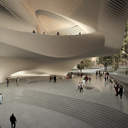
Parametrick design is the IN thing today. If you don't know how to use advanced digital softwares...you don't belong to the Kewl group. But no worries...cuz the only cool thing about 'em are the forms....the peeps behind it...are actually geekozoids. You hafta learn Maya, Rhino and other animals in the 3d modelling world to be able to sport a hot fashionable architechuh. Before you know it, you are already balding... or hairline is already receding.... i hope this is not the case behind kokkugia, a studio of three young guys who obviously came from digital savvy schools such as Heyhey and Columbyah. The design (posted in Designboom) is their entry for the Taipei Performing Arts Center Competition which was won by OMA. Their scheme looks like meta scraps king kong crampled and made into a roof. WHICH by the way..takes forever to make in a modelling software! The program was influenced by the contour underneath so you have those boxes... on top of it...kingkong threw the scraps...
Kingkong has been scraping his mucous and booger on the scraps..sp underneath it created these interesting network of trusses....awesome..isn'tit?

Friday, February 26, 2010

Clappers in 36 The Calls competition

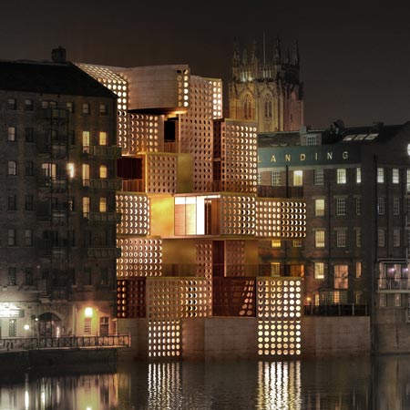
These two are not shortlisted entries.... Just two of the few designs that were featured in other blogs bec of ...I guess...design metits..... It is for the competition 36 The Calls which asked participants to design a building in a vacant lot in Leeds, You OK. It is like providing a missing link, except architects really like their work to stand out..so they make their building cuss from its context. Which is cool because, you dont want another fake oldy built. ...so these two ...a cucumber and a cheesegrater didnt make the cut in the said competition. For the cucumber scheme which studiodosi designed.... cant really describe it well.. it just looks like a huge drum covered with plants that glow in the dark. the program is bohooo... nothing new....but clap clap for thinking of the environment....anyways...if you have a garden roof and climbing ivies on walls..you receive an instant clap clap from design dummy...(as if it matterS)....
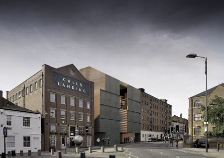
The second one..designed by Davide Marchetti Architetto..which was ...something that looks like a scheme that had a more interesting program and B.S.--ing with it's design..which is really just "push and pull"... is more fitting with the context....according to the designers is made of rammed earth where they introduced the holes....these walls act as sunscreen..... however, it looks like copper in the renderings. I agree with one of the comments in Dezeen that the it was a big mistake to make the opposite side (street side) a blank wall...it is like J.Lo without the ass....


"Lladro" Erotica


I tot'at'ferst, that this was a work of a jap. We all know that japs are stylish and fashionable... but because of their awesome 80s animation and comics...like manga... they can also be pretty much.... as-horny-as-everybody-in-the-world-can-get.. prolly hornier. This post is long overdue since the exhibitionists figurines were showed only until Feb 15 in Gallery Nine NY. weee NY! I first saw it in Dezeen but when I saw it again in Karmatrendz...there was a divine intervention that called me to repost it.... It is called Undressed by Jessica Lichtenstein. I cant help notice the use of past tense - undressed. The girls are still covered...I aint seein titties and pussies yet...just all provocation and eroticism (which I still love). that's my foyst comment. Also, I wonder if these were pure manga and anime merchandise...will it still qualify as art since it was made by japs themselves? Does it mean it has to be a work of a non-jap to be regarded as artistits?Other than that... all i can say that this is 21st century Lladro evolution..aint sure if these figurines are made of porcelain or some kind of stone material.... but if it is...yes...21st century lladros... that will never go along with your chinaware...bec these look like toys.... if you have a console for sextoys...these will def look geeeewd. they look like plastic or some kind of rubber...soft and supple....like dildos.... toys you never had when you were a kid.


Thursday, February 25, 2010

Calatrava's Manolo Blahnik


We have seen Zaha design her shoes...which turn our to look very her...not ursula-ish....curves and all that. With this blog entry, the architect's works become the inspiration. In Dezeen, Tea Petrovic's Shoes pay homage to Calatrava and a sculptor named, Naum Gabo. I am not so familiar with the sculptor, but with Santhiagoh....we go waaayyyy back...UH HUH... way back... way back when the only architects you knew was Frank, Louis and Mies... then all of a sudden Santiago's bridge make a debut...so pristine and white but dynamic...So I said... Eero Saarinen is so last decade (snap snap on air) ... Don't get me wrong, I love Eero.... in a vintage kind of way. Santiago has really defined himself in the world of architecture geeks...whose designs are becoming a source of aesthetic. Now I wonder, if Tea is alluding her design aesthetic to other artists/designers..im curious what her own design voice is. Still, even if I am not a shoe lover, the first time I saw these Petrovic's shoes, I remember myself seeing Caltrava's bridge for the first time. It was like the orgasm that Carrie Bradshaw was having over a pair of Manolos. Purely magical.


Wednesday, February 24, 2010

Zaha Hadid's Block


Speaking of Ursula.Found this post at dezeen the other day. Zaha's design of the King Abdullah II House of Culture & Art. How can you not love Haha's new opus? We usually get aversion towards her work whenever something new comes out (because of insecurity ferhafs). I remember in one forum that,with the numerous projects Zaha's firm (can you call it firm) is doin, it is actually not Zaha who designs anymore. A lot of em' are grads from AA where Ursula and his partner, Patrick Shoemaker regularly hangs out and drink beers. Just an fyi, AA is where Zaha learned to be wild.Goin back to this performing arts center, I have to admit, this is one of my favs in Hadid collecshun. The design is derived from the carved stone buildings and eroded rock formations at Petra in Jordan.
IF you have a perfectly square stone with carved-like formation in the mid, don't you think it is already amazing? Blow it up and you have King Absduhllah's center. From afar, people can look like termites and Zaha is the queen giving birth to millions of her admirers....i mean followers. I remember this song from JLO:

Don't be fooled by the rocks that I got
I'm still, I'm still Zaha from the block
Used to have a little, now I have a lot...

One wonders what's next for Zaha or what her minions will do next. Together with Patrick Schumacker, theyve done almost everything in the formal design approach. Can they leave some to others? Ok..Insecure much?


Star Designers Look Alike - Zaha Hadid


Let's pretend Design is Hollywood. We have star designers right? It is really unfair that designers make beautiful buildings and they are not treated with the right admiration. I think it is time to really elevate star designers to celebrity status. Let's start with Zaha Hadid. Who do you think she resembles the best?

The photo of Zaha Hadid above is smokin hot with her trademark Issey Miyake clothing (not sure)...so who ... I say the last one (before Bette D.)

OOOoooooma Therman?
Mrs. Smith?
Hot Diana Ross?
Angela Lansbury (I dont know who she is)

Mort of Madagascar?
Bette Davis?
Enrique Iglesias? (the mole)
or Ursula of Little Mermaid? (thanks to .._. .._ _._. _._ of Archinect)

SDO's Paper (t)Pubes


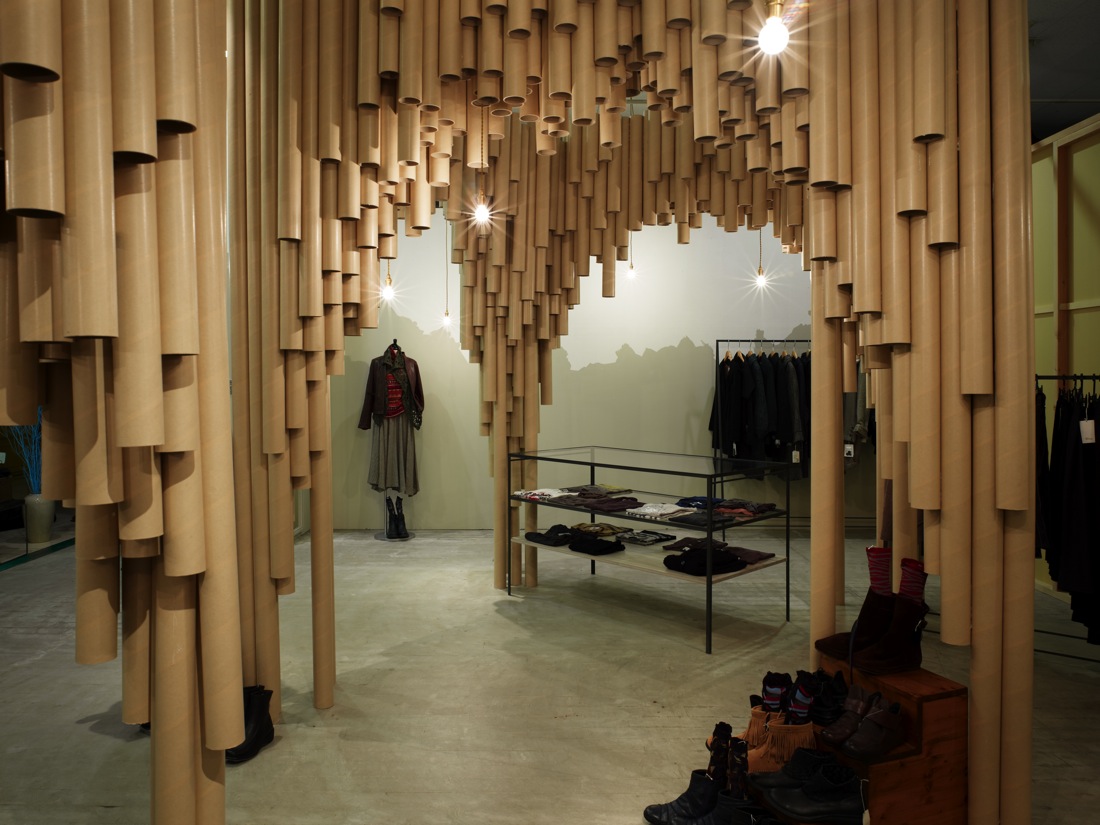
Ok. For a while I thought that the store is just a storage with some clothes in it. I must say that the designers are lucky to have a client who is design savvy. Well Japanese folks are generally stylish and fashionable. I said that because, it is rare that an overpowering design like this is applied to a store. Do you notice the design before the merchandise? It's probably because the store really wants to get noticed. But since the material is "paper-ish" with an impression that is "box-ish" in a "storage-ish" kind of way, then maybe the clothes stand out. "Maybe-ish."

If you scroll down at ArchDaily's post of Suppose Design Office's Karis store you see how the paper tubes create cathedral-like spaces. By the way,I love paper (t)pubes. IT was all started by pringles look alike Shigeru ban (I think) with his chapel and all..... I just wish that SDO didn't put gloss onto the tubes. They look like pipes or downspouts. Take out the clothes, this will make a gaddamn hardware store for pipes. forget P.S.1! I can imagine people peeping through the holes at the bottom. Blow air into it, it might even create sound. So many possibilities. I imagine me, scraping my booger in one.


Tuesday, February 23, 2010

Rug doll


Anyways, I ran across this post...and I thought it looks so comfy. They have different variations of this called M-Series by Yellow Diva posted at Contemportist blaaag. While the buttons add a lil somethin to somethin.. (like putting scent on your resume) ..i cant help be reminded of rug dolls. i think they belong in the same family.
Emotion dolls by Kimochi

SADAR+VUGA Centipede Tower


It is not eeezzeee to design a skycrapuh. I should know..... I haven't done any. When I saw this tower at ArchDaily called Magnolia Tower by SADAR + VUGA I was like.....nothing...then I farted. This post should be part of Swollen series because of the bump on the mid part of the tower. If you look at the plans at ArchDaily, it wasnt really a bump. The rendering might...just might be suggesting that the feathery skin of the tower is just moving, blown by air. Details of the sun shading devices look interesting (image below) . From afar, they look like fingerlings but up close, they are like feathers with girly perforations..so elegant..and so gay.

It is good to note that designer in Dubai are becoming climate sensitive with their proposals. Dubai is so freakin hot. Your undies soak in your groin-region sweat, good thing I shower that area of mine with expensive cologne.... Going back to this Sadar -Vooooga designed tower, the fins really look like feathers of a skirt. It looks refreshing. You feel like wearing it and your in betweens are well ventilated.

MCP4AZEWT9BG

Monday, February 22, 2010

Genormous Bathroom


I am always a fan of patterns and prints on buildings. Although it is just external, it makes the building stand out from its surroundings. Take this Companies Incubator at ArchDaily designed by Manuel Craca Dias + Egas Jose Vieira. Who can ever thought that tiles are so in? In this case, it is soooo OUTside. Move over Bisazza! It feels clean and fresh, put a smudge of mud..you have a skid mark then voila! you have a toilet palace! It is clever how the designers alternated the patterns to really veer away from the traditional checkered pattern. Had it been like that, it would have made the building interactive. We can play chess and TIT tac toe.


Swollen series


It's a day of swollen designs. First is Welding wood by CuldeSac posted at Contemporist blog. Which is in my onion is just ordinary but def not ugly. A reader even commented that it is really nice except for the self aggrandizing B.S. . The designers stated that they brought back the antiquated techniques of lathe turning and steam bending.oooooohh Whatever it is, the furneechur just looks like they have adam's apple.


Second is Swollen Wall by Paul Coudamy by the same design blog. Not the first time I see a shelve design like this. What makes this terrible are the insertions of those white boxes, it looks disorienting. So messy, it makes you want to make more mess. Maybe i am just a fan of clean designs because I am clean and sober now. hik!


Saturday, February 20, 2010

Rehashed VitraHaus?


VitraHaus isthatchoo?... or Fujimoto,wasthatchoo?

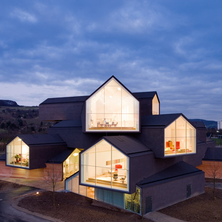
O my effin gaud....di ... I hope it is not true that Herchoke and de Morning is just an early riser to architecture stardom that's why they were able to build the "Vitra House"... Tokyo Apartments idea of Sou Fujimoto is almost the same... Just lengthened these volumes and voila, you have vitra! Now that I mentioned it, Sou's version is very juvee... they still dont know how to penetrate.... where as HDMs already know how to bolt in.


Friday, February 19, 2010

Cinderella goes to Vegas


Another post by Dezeen several days ago was Cinderella's Chair by Anna Ter Haar
Isn't this more, an art than design? Why!? I looooooveee nude painting!....
However, the chair looks mutilated. They had to use a nekkid woman to titillate interest... well...it worked. More than glass slippers, I imagined Cindy as a pornstar giving Mr.Hook a lap dance.... The chair is amputated with a support that is fragile. One thinks if this chair is even functional. Yup, it may be an art piece.... Come to think of it, if this chair is placed along with it's kind (The post in Dezeen shows a lot of variations in size, shape and color) they will all look like junk. Hmmm... that sounds mean, but i meant installation kind of junk... with the nude girl.
The chair is also discriminating. Let's face it, if you are over 190 lbs you will not be allowed to sit on this chair. One comment even said that,once it breaks, glass shards can cut people. I remember a lawsuit filed against a fastfood chain for not putting "Caution: very Hot" on their coffee cup. Anna Haar should put "Caution for FATsos"


Orgy of Houses


Ok. It's been a while since I licked this website...until I saw some interesting entries online. One of which is
Dezeen's post on VitraHaus by Herzog and de Neurons. It is really impressive to see the rendering come alive and translate into this (above photo) When the renderings of VitraHaus first came out, Iwas like...Uh! It might not even get built.... but then I remember the other Vitra buildings.... there's even that Fire Staion by Haha Zadid. Anyways, going back to VH by HdM..... Hope to see some plans. I wonder how one goes to the other house. The stacking of the volumes can make you horny... like bodies on top of another...or something penetrates the other...

ShareThis